... that they really, really, really don't want you to see. Expect a revision in the way unemployment is calculated soon. Never mind that it's already ridiculously tilted in favor of making politicians look good.
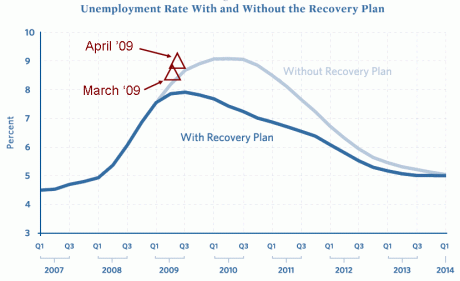
In case there's any confusion, the lines on the chart were the projections that Ogabe's "economists" used to sell their "stimulus" package -- the darker one being how much better (lower) unemployment would be if the "stimulus" were passed. The red triangles are markers for the last two months of unemployment data which is of course coming in worse than their projection of what things would be like without the "stimulus" plan.

In case there's any confusion, the lines on the chart were the projections that Ogabe's "economists" used to sell their "stimulus" package -- the darker one being how much better (lower) unemployment would be if the "stimulus" were passed. The red triangles are markers for the last two months of unemployment data which is of course coming in worse than their projection of what things would be like without the "stimulus" plan.
So once again, let’s see how the actual unemployment numbers compare to what Obama’s own economists predicted:


No comments:
Post a Comment